“And that’s a 10 for artistic impression!”
First up, before anything else – RIP Simon Andrews, and Sir Jack Brabham.
Welcome to Formula 1 Anonymous… My name is Andre Harrison… And for all five people, unaware… I’m a Sebastian Vettel fan. Shock horror. Maybe given how 2014 has been the “Year of the Hamilton”, being a Vettel fan isn’t such a sin. Ha.
Anyway, this is a natural combination of two things I love doing; making lists, and talking about my favourite driver. Many drivers are known for their legendary helmet designs; such as Ayrton Senna’s yellow, Jacques Villeneuve’s multi-coloured segments and James Hunt just slapping his damn name on the side, they’re iconic with F1 history.
Sebastian Vettel likes to make his mark a different way, and that’s by constantly changing his helmet designs. Maybe in some kind of reverse logic, that makes it iconic in its own way? I dunno, but in Seb’s tradition, he retires a helmet after winning a race in it, and as a result, he’s had over 60 different helmet designs in his career to date since 2007!
In the first of my Top 10 series, here’s my look at my personal favourite Top 10 Sebastian Vettel helmet designs. Obviously, this is purely my opinion, and I haven’t really got a straight criteria, but obviously artistic impression, historical significance and any and all references count as bonuses. Right, enjoy the countdown!
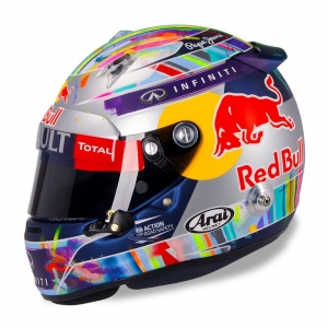
[fusion_builder_container hundred_percent=”yes” overflow=”visible”][fusion_builder_row][fusion_builder_column type=”1_1″ background_position=”left top” background_color=”” border_size=”” border_color=”” border_style=”solid” spacing=”yes” background_image=”” background_repeat=”no-repeat” padding=”” margin_top=”0px” margin_bottom=”0px” class=”” id=”” animation_type=”” animation_speed=”0.3″ animation_direction=”left” hide_on_mobile=”no” center_content=”no” min_height=”none”][fusion_imageframe lightbox=”no” style=”bottomshadow” bordercolor=”” bordersize=”0px” stylecolor=”” align=”right” animation_type=”fade” animation_direction=”right” animation_speed=”1″]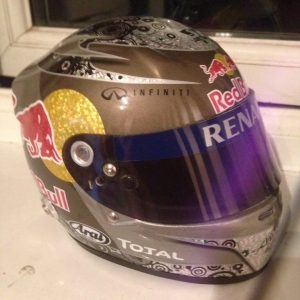 [/fusion_imageframe] Honourable Mention: The Compact Discs (Singapore-Abu Dhabi 2010)
Okay, I’m biased, sue me. I couldn’t do this countdown without mentioning this design. [/fusion_builder_column][fusion_builder_column type=”1_1″ background_position=”left top” background_color=”” border_size=”” border_color=”” border_style=”solid” spacing=”yes” background_image=”” background_repeat=”no-repeat” padding=”” margin_top=”0px” margin_bottom=”0px” class=”” id=”” animation_type=”” animation_speed=”0.3″ animation_direction=”left” hide_on_mobile=”no” center_content=”no” min_height=”none”][fusion_tooltip title=”Fun Fact: That picture is indeed, my mini-helmet. Beauty ain’t she?”]Mainly because[/fusion_tooltip], I actually own the mini-helmet version of this in my house! It’s gorgeous on the mantelpiece, really.
And as a bonus, there’s some historical context to this one too, as it was the helmet design Seb sported when he won his 1st World Championship, which is probably why the Red Bull shop released it in the first place! And now it sports a spot on my window sill hall of fame, which includes a picture of my late nan, my phone, an when I’m a lazy git, my Xbox controller. As you do. Right, onto the actual list!
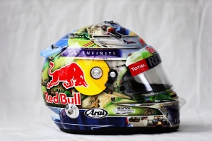
[fusion_imageframe lightbox=”no” style=”bottomshadow” bordercolor=”” bordersize=”0px” stylecolor=”” align=”right” animation_type=”fade” animation_direction=”right” animation_speed=”1″] [/fusion_imageframe] #10 – The Team Shoutout (Britain 2013)
 [/fusion_imageframe] #10 – The Team Shoutout (Britain 2013)
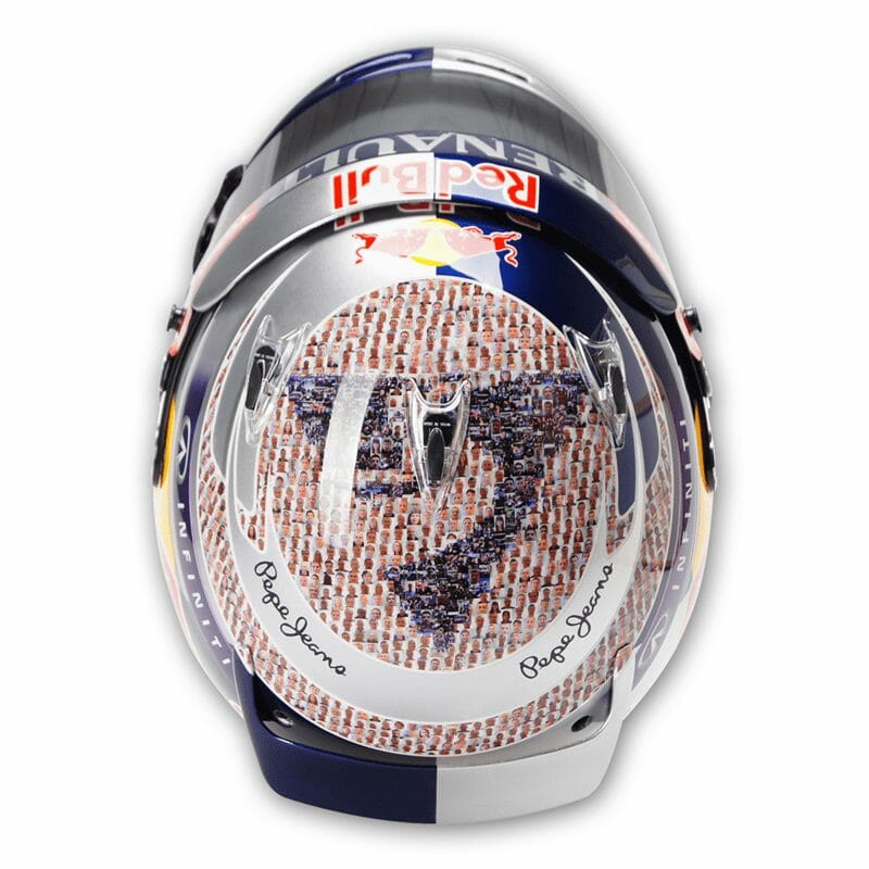
I loved this. Red Bull seem to have this gimmick where pasting people’s faces in the form of mosaics are cool. They’ve done it frequently in the United Kingdom for the Wings For Life charity for Spinal Cord research, and for a small donation, you could have your face on their car. Sebastian seemed to add that similar idea to helmets, first in 2011 when he had the crew hand-painted on his helmet (To incredible detail may I add, very nearly made this Top 10), but he took it to another level at Silverstone last season when he had a mosaic design featuring the entire Red Bull team, crew, and backstage staff in Milton Keynes, photographed and then stitched together on his helmet.
It’s an incredible effort, an incredible amount of detail, and I love the fact that Seb took the time out to give a little something back to the hundreds of people behind him that never get as much credit for their roles and contribution towards Seb’s success and the team.
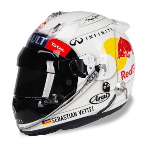
[fusion_imageframe lightbox=”no” style=”bottomshadow” bordercolor=”” bordersize=”0px” stylecolor=”” align=”right” animation_type=”fade” animation_direction=”right” animation_speed=”1″] [/fusion_imageframe] #9 – The Driver’s Trophy (Bahrain 2014-)
 [/fusion_imageframe] #9 – The Driver’s Trophy (Bahrain 2014-)
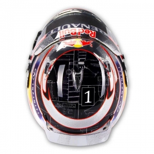
This is the first of a few from the five designs Seb’s had in the 2014 season (so far), and across the board, it’s just awesome. First up, I love the FIA’s new ruling of having the driver numbers on the helmet, it adds a little more personalization to the designs, across the board. Then it has three colours you can never go wrong with in just about anything (Except maybe car rims), and that’s Black, Chrome and Red. It looks crisp.
Then on top of that, on the central head of the design, there’s the original drawings for the World Driver’s Championship trophy, one of the trophies not seen very often as they’re given out after the season ends, in a fancy ball. But it looks awesome, like having a helmet from Tron or some other Sci-Fi movie in the end. And the “1” just seals it.
[fusion_imageframe lightbox=”no” style=”bottomshadow” bordercolor=”” bordersize=”0px” stylecolor=”” align=”right” animation_type=”fade” animation_direction=”right” animation_speed=”1″] [/fusion_imageframe] #8 – The White Rainbow (Singapore 2011)
 [/fusion_imageframe] #8 – The White Rainbow (Singapore 2011)
Believe it or not, I have a massive soft spot for this one, and this is one of the WEAKER designs from Singapore. Seb seems to really love this place; whether it be driving around it, and/or whether it’s a matter of having really pretty helmets that go alongside the night race theme (See Abu Dhabi as well on that one), that have a tendency to just look awesome on those super slow-mo shots and high-res photos the F1 photographers take.
This one still makes the list as like I said, it grew on me a lot the more I saw it. I have a thing for white – It’s always a really clean colour and you can never [/fusion_builder_column][fusion_builder_column type=”1_1″ background_position=”left top” background_color=”” border_size=”” border_color=”” border_style=”solid” spacing=”yes” background_image=”” background_repeat=”no-repeat” padding=”” margin_top=”0px” margin_bottom=”0px” class=”” id=”” animation_type=”” animation_speed=”0.3″ animation_direction=”left” hide_on_mobile=”no” center_content=”no” min_height=”none”][fusion_tooltip title=”Apart from Suits. You’ll look like a Pimp. Or someone out of Saint’s Row.”]really go wrong[/fusion_tooltip] with it, and the rainbow swirls really lit up and glittered during the night, which is why I’m glad it only made the one appearance, it just wouldn’t have worked as well at any other track with natural sunlight. That’s what makes it special…See kids, context is important.
Note: As I may have already hinted, this is NOT the last time a Singapore helmet gets on this list…
[fusion_imageframe lightbox=”no” style=”bottomshadow” bordercolor=”” bordersize=”0px” stylecolor=”” align=”right” animation_type=”fade” animation_direction=”right” animation_speed=”1″] [/fusion_imageframe] #7 – The Blue Man Group (2014 Jerez Tests)
 [/fusion_imageframe] #7 – The Blue Man Group (2014 Jerez Tests)
I’m blue, da-ba-dee da-ba-da…Remember that one from Eiffel 65, singing about Blue? It reminds me of this helmet. I love the blue chrome on this one, a lot. You can see your reflection in it and everything! That s*** is cool to me.
But on a larger left, the references and historical significance mean a lot on this one. First of all, it’s the first Seb helmet design to ever have his selected driver number of 1 on the front. As I said at #9, numbers add a little personalisation to a helmet and a driver on the whole. I love the fact it was inspired The Blue Man Group. And something not many people even know, is that [/fusion_builder_column][fusion_builder_column type=”1_1″ background_position=”left top” background_color=”” border_size=”” border_color=”” border_style=”solid” spacing=”yes” background_image=”” background_repeat=”no-repeat” padding=”” margin_top=”0px” margin_bottom=”0px” class=”” id=”” animation_type=”” animation_speed=”0.3″ animation_direction=”left” hide_on_mobile=”no” center_content=”no” min_height=”none”][fusion_tooltip title=”To be fair, he did this for his Korea 2011 helmet too!”]every race win[/fusion_tooltip] and location he won the World Championship in, is etched into the silver lines on the helmet. The dates he won all 4 World Championships are etched into the circle above the #1.
I know, obviously, no-one’s ever going to see it when racing, but I just love little details like that, it just adds character and depth to the whole design. Sometimes, the simplest designs can be really awesome, and this is an example of that. Just don’t use blue chrome for your car rims…Can’t say I recommend that.
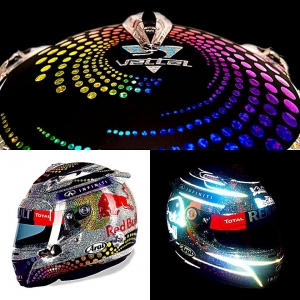
[fusion_imageframe lightbox=”no” style=”bottomshadow” bordercolor=”” bordersize=”0px” stylecolor=”” align=”right” animation_type=”fade” animation_direction=”right” animation_speed=”1″][/fusion_imageframe] #6 – Art Meets Action (China 2014-)
 [/fusion_imageframe] #6 – Art Meets Action (China 2014-)
You know that Sky Sports F1 promo in the pre-season that involved the entire F1 team just flinging paint at each other? (Be honest, who doesn’t love Natalie Pinkham getting [/fusion_builder_column][fusion_builder_column type=”1_1″ background_position=”left top” background_color=”” border_size=”” border_color=”” border_style=”solid” spacing=”yes” background_image=”” background_repeat=”no-repeat” padding=”” margin_top=”0px” margin_bottom=”0px” class=”” id=”” animation_type=”” animation_speed=”0.3″ animation_direction=”left” hide_on_mobile=”no” center_content=”no” min_height=”none”][fusion_tooltip title=”If you don’t…You’re a damn liar.”]down and dirty[/fusion_tooltip]), I think Seb’s helmet designer just put a blank helmet design in the middle of the set for that scene and just let them go to town on it.
But in all seriousness, this is one of the most visually stunning designs Seb’s had for a helmet to date. For sure, it’s the most colourful. And it’s another one that’s really grown on me this season so far. Again, the #1 is a nice little touch as well, and overall, it’s so visually striking, you can’t take your eyes off it very easily, like a watercolour painting, or looking at some ink really closely. I think it’s awesome, and I almost hope he rotates more between the 5 designs he’s had in 2014, so this one doesn’t get retired very easily!
Note: That last paragraph was probably total bollocks, I SUCKED at art as a child.
[fusion_imageframe lightbox=”no” style=”bottomshadow” bordercolor=”” bordersize=”0px” stylecolor=”” align=”right” animation_type=”fade” animation_direction=”right” animation_speed=”1″][/fusion_imageframe] #5 – The Striptease (Monaco 2013)
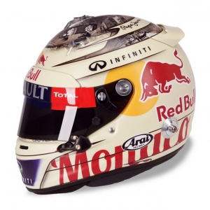 [/fusion_imageframe] #5 – The Striptease (Monaco 2013)
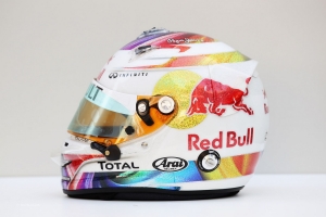
This one was just straight up cheeky. But I love the design on this one a ton. Monaco 2011’s mosaic piece very nearly made the final 10 as it was, but the main elements of that one, were featured (in my eyes) a little bit better in this one.
First up, love the colour. That ivory style, matt-white is really sweet. Like I’m looking at a pearl. Then you have the pictures of one of Seb’s heroes, Sir Sterling Moss at Monaco during the 1960′ Monaco GP, which he won that year. That along with the poster sized “Monaco” on the side, probably would have cracked the Top 10 on it’s own.
What made it crack the Top 5 for me, was, yes, the poster girl on the back of the helmet. I can’t help it, it’s awesome. Like Marilyn Monroe in her prime…Y’know, before teenage girls started idolizing her on social media. But the fact they went to such detail in making her [/fusion_builder_column][fusion_builder_column type=”1_1″ background_position=”left top” background_color=”” border_size=”” border_color=”” border_style=”solid” spacing=”yes” background_image=”” background_repeat=”no-repeat” padding=”” margin_top=”0px” margin_bottom=”0px” class=”” id=”” animation_type=”” animation_speed=”0.3″ animation_direction=”left” hide_on_mobile=”no” center_content=”no” min_height=”none”][fusion_tooltip title=”Like one of those old school pens that stripped when you turned it upside down…”]clothes come off [/fusion_tooltip] when the helmet got warmer, is incredible detail, makes sense, and just oozes class.
While the whole thing probably [/fusion_builder_column][fusion_builder_column type=”1_1″ background_position=”left top” background_color=”” border_size=”” border_color=”” border_style=”solid” spacing=”yes” background_image=”” background_repeat=”no-repeat” padding=”” margin_top=”0px” margin_bottom=”0px” class=”” id=”” animation_type=”” animation_speed=”0.3″ animation_direction=”left” hide_on_mobile=”no” center_content=”no” min_height=”none”][fusion_tooltip title=”Hence why I’m not showing the woman…It’s a family blog!”]isn’t safe for work[/fusion_tooltip]… Isn’t that what Monaco’s all about? Maximum style points on this one.
[fusion_imageframe lightbox=”no” style=”bottomshadow” bordercolor=”” bordersize=”0px” stylecolor=”” align=”right” animation_type=”fade” animation_direction=”right” animation_speed=”1″][/fusion_imageframe] #4 – The Glitter Ball (Singapore 2013)
 [/fusion_imageframe] #4 – The Glitter Ball (Singapore 2013)
Welcome to Part 2 in the trilogy of Singapore helmets, and amazingly, only the 2nd design from the colossal year of 2013. I put this one up at #4 because my GOODNESS it’s startling, but also in more ways than one!
First up, Silver shines at night with the glitter WAY better than the multi-coloured swap shop that the “White Rainbow” had earlier on the list. But they also kept that part for the rainbow designed logo, which again, looks fantastic and a great compliment to the black and the chrome (Again, part of the driver trophy design from earlier)
But then the icing on the cake…The freaking thing GLOWS IN THE DARK. Because as any 90’s kid will tell you, something is ALWAYS cooler if it glows in the dark, like a rod of plutonium in The Simpsons or something. Visually striking, a cool gimmick and the added bonus of looking amazing at night? Yeah, it had to be #4.
DISCLAIMER: These Top 3 are the really, REALLY good ones if you ask me – A cut above the rest!
[fusion_imageframe lightbox=”no” style=”bottomshadow” bordercolor=”” bordersize=”0px” stylecolor=”” align=”right” animation_type=”fade” animation_direction=”right” animation_speed=”1″] [/fusion_imageframe] #3 – The Night Sky (Singapore 2012)
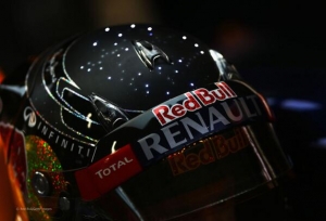 [/fusion_imageframe] #3 – The Night Sky (Singapore 2012)
Thankfully this is the 3rd in the trilogy that’s actually somewhat satisfying. Yep, three Singapore designs got on this list. See, told you they were special.
Top to bottom, this one is just amazing. Again, the sparkling glitter for night viewing returns, only this time, much more suttle, emphasising on the Red and Yellow of the Red Bull logo, but the all-black design is solid enough as it is. Then it’s dotted with stars to look like the night sky..
…But then, the clincher which took it to Number 3 on the list…The LED lights in the top of the helmet, that light up as he drove. [/fusion_builder_column][fusion_builder_column type=”1_1″ background_position=”left top” background_color=”” border_size=”” border_color=”” border_style=”solid” spacing=”yes” background_image=”” background_repeat=”no-repeat” padding=”” margin_top=”0px” margin_bottom=”0px” class=”” id=”” animation_type=”” animation_speed=”0.3″ animation_direction=”left” hide_on_mobile=”no” center_content=”no” min_height=”none”][fusion_tooltip title=”Valentino Rossi tried this too for Qatar 2014 in MotoGP, but wasn’t allowed to race in it. Boo.”]24 LED’s arranged[/fusion_tooltip] in 3 groups of 8 lights each. Each group makes up a sign of the zodiac that belongs to a member of Seb’s family. The lights are battery powered and sensory – triggered by motion. The helmet was approved by FIA for the race but after that LED’s and batteries were banned. I have NEVER seen that in a racing helmet before and probably will ever again. Such amazing creativity and uniqueness of design…It was just perfect for the Singapore track, the setting, for everything. Just a beautiful helmet that would make an ideal fit in a gallery, or an observatory…Just don’t burn out the batteries, they’re a nightmare to replace, apparently.
[fusion_imageframe lightbox=”no” style=”bottomshadow” bordercolor=”” bordersize=”0px” stylecolor=”” align=”right” animation_type=”fade” animation_direction=”right” animation_speed=”1″][/fusion_imageframe] #2 – The View From Austria (Brazil 2013)
 [/fusion_imageframe] #2 – The View From Austria (Brazil 2013)
A bit weird that a helmet for a Brazilian Grand Prix ends being all about Austria, doesn’t it?
The symbolism behind this one isn’t that relevant. It was a design to celebrate the return of The [/fusion_builder_column][fusion_builder_column type=”1_1″ background_position=”left top” background_color=”” border_size=”” border_color=”” border_style=”solid” spacing=”yes” background_image=”” background_repeat=”no-repeat” padding=”” margin_top=”0px” margin_bottom=”0px” class=”” id=”” animation_type=”” animation_speed=”0.3″ animation_direction=”left” hide_on_mobile=”no” center_content=”no” min_height=”none”][fusion_tooltip title=”It’ll ALWAYS be The A1 Ring to me…”]Red Bull Ring[/fusion_tooltip] to the Formula 1 calendar for the 2014 season, complete with classic cars heading up the hills and Austrian forests. Maybe they’ll find Arnold over the over end in a jockstrap and cowbell. The same design has now ended up becoming the passes and ticket posters for the event itself later in the year.
But the reason this helmet made Number 2 is simple. This helmet is the most beautifully painted design that Seb’s ever had for a helmet, in my opinion anyway. It’s just terrific. The hills in the background, the scenery, the reverse camera shot of Seb, the other Red Bull in the background…It’s just perfect.
If there’s only one nitpick…The Red Bull logo’s actually get in the way, it impedes and taints the beautiful paint job ever so slightly…Remove some of that corporate sponsorship and this may have even been #1.
P.S. For more awesome images of the poster, google image search for “2014 Spielberg GP” or go to their interesting website.
[fusion_imageframe lightbox=”no” style=”bottomshadow” bordercolor=”” bordersize=”0px” stylecolor=”” align=”right” animation_type=”fade” animation_direction=”right” animation_speed=”1″][/fusion_imageframe] #1 – The Red Bull Stratos (Bahrain 2013)
 [/fusion_imageframe] #1 – The Red Bull Stratos (Bahrain 2013)
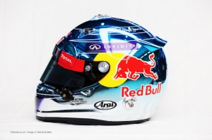
And the winner is…The Stratos. I had a feeling many of you could have already guessed this one, but for me, this ticks every box for a brilliant design.
In case you didn’t know already, this helmet is dedicated to the Red Bull Stratos experiment, where daredevil and man with 10 stone testicles, Felix Baumgartner, jumped from the edge of space, over 100,000 ft to the Earth’s surface, breaking the sound barrier and multiple World Records in the process, in one of the truly incredible moments of the last decade.
This design was based off the same helmet Felix used, and it is BADASS. I love the basic white, the Stratos labelling is perfect, the tail at the back is awesome, and I love the little detail of painting the under visor of the helmet black to match an actual Astronaut’s helmet. As I always said, it’s the little details that add up to make a big difference.
But just for sheer cool factor alone, this had to be #1 for me. Just a brilliant design, a fitting tribute, and like I said, it just ticks every box for me as a design. Just awesome.
Any designs I missed? There’s some more honourable mentions below, but let me know if I missed any in the comments. Hope you enjoyed the post and I’ll catch you guys next time. Sayonara!
(More mentions that didn’t quite make it: Australia 2012, America 2012 and 2013, Monaco 2011, Britain 2011)
Thanks to Sebastian-Vettel.org for the shots, and for Parc Ferme F1 for the extra info, it really helped![/fusion_builder_column][/fusion_builder_row][/fusion_builder_container]