Hey folks, Dre here. Turns out we’ve now seen pretty much all 11 of the 2014 Formula 1 cars in some capacity…Some more than others. Lotus, I’m looking at you.
Anywho, because a fair few people have asked me what I make of the 2014 car designs for the up and coming season, I thought it would be a fun idea to rank them in terms of general look. Now, I’m now fashion student, and of course, this is just my opinion, so take that for what it is.
To be honest, I never thought my blogging career would reach the point where I’m talking about Formula 1 cars and comparing their front wings to see how much they look like a penis. Funny how these things turn out.
#11 – Caterham
[fusion_builder_container hundred_percent=”yes” overflow=”visible”][fusion_builder_row][fusion_builder_column type=”1_1″ background_position=”left top” background_color=”” border_size=”” border_color=”” border_style=”solid” spacing=”yes” background_image=”” background_repeat=”no-repeat” padding=”” margin_top=”0px” margin_bottom=”0px” class=”” id=”” animation_type=”” animation_speed=”0.3″ animation_direction=”left” hide_on_mobile=”no” center_content=”no” min_height=”none”][fusion_imageframe lightbox=”no” style=”bottomshadow” bordercolor=”” bordersize=”0px” stylecolor=”” align=”none” animation_type=”fade” animation_direction=”right” animation_speed=”1″]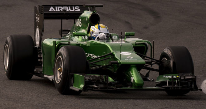 [/fusion_imageframe]
Oh. Dear. God. I think someone on Twitter said it best: “It’s looks like they’ve been sipping Absinthe through a straw. My God, it’s ugly. They just thought: “Hang on, let’s just stop the front nose right here and stick the Hulk’s (No, not Nico’s) appendage on the end of the car. It’s a shame really, as the rest of the car isn’t awful, but yeah, that sticks out like…I’ll let you make your own jokes on that one.
#10 – Toro Rosso
[fusion_imageframe lightbox=”no” style=”bottomshadow” bordercolor=”” bordersize=”0px” stylecolor=”” align=”none” animation_type=”fade” animation_direction=”right” animation_speed=”1″]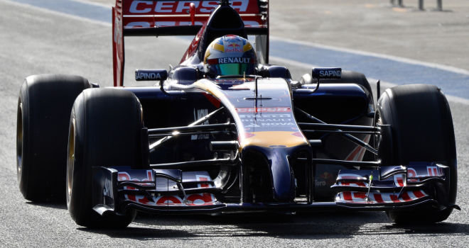 [/fusion_imageframe]
You know you’ve “dun goofed” with your front, when freaking Ann Summers is making note of it on their Twitter page:
So it looks like Toro Rosso have taken inspiration from our sex toy collections #collaborationopportunity pic.twitter.com/EpqookmuwJ
— Ann Summers (@Ann_Summers) January 27, 2014
Yeah…That thing is swinging. That in addition of playing it REALLY safe with their livery this year, means a very low score. Put it away!
#9 – Williams
[fusion_imageframe lightbox=”no” style=”bottomshadow” bordercolor=”” bordersize=”0px” stylecolor=”” align=”none” animation_type=”fade” animation_direction=”right” animation_speed=”1″]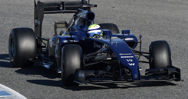 [/fusion_imageframe]
Remember when people threw their toys out of the pram when Williams revealed their car? That was the downside of being one of the first to reveal their car. I don’t think a lot of fans realised just how collectively “not pretty”, their cars were going to be…Now we’ve seen all 11, it doesn’t quite look so bad does it? They’re only at 9 for now, I could move them up (or down) later depending on what their 2014 livery looks like. The all blue isn’t too bad to be honest.
#8 – Lotus
[fusion_imageframe lightbox=”no” style=”bottomshadow” bordercolor=”” bordersize=”0px” stylecolor=”” align=”none” animation_type=”fade” animation_direction=”right” animation_speed=”1″]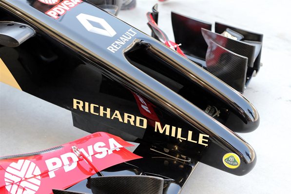 [/fusion_imageframe]
I commend Lotus for trying to be truly different and not adopt the penis nose. Hence the #8 slot. A shame is, they’ve gone down the other end and gone for the…other…genders…*gigglesnort*
Or, you could go for the PG version, the forklift! The fact they’ve had to have one tusk longer than the other to conform to regulations makes it look even weirder. A shame really considering it has one of the better liveries on the current grid. As Sam Sparro would agree, you can’t go wrong with Black and Gold.
#7 – Sauber
[fusion_imageframe lightbox=”no” style=”bottomshadow” bordercolor=”” bordersize=”0px” stylecolor=”” align=”none” animation_type=”fade” animation_direction=”right” animation_speed=”1″]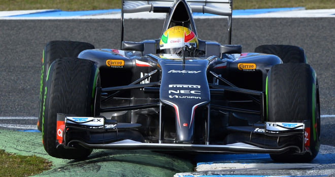 [/fusion_imageframe]
I still love the Batmobile style paintjob, but the front end’s a bit…Long for my liking. Again, people complained that they stayed with the livery colour…My response: If it ain’t broke, don’t fix it.Again, just a shame certain elements stand out…Can you tell I’m running out of jokes? Middle of the road slot for Sauber.
#6 – Marussia
[fusion_imageframe lightbox=”no” style=”bottomshadow” bordercolor=”” bordersize=”0px” stylecolor=”” align=”none” animation_type=”fade” animation_direction=”right” animation_speed=”1″]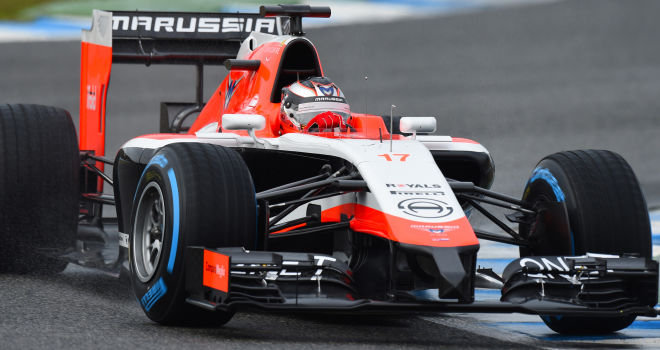 [/fusion_imageframe]
This is the highest Marussia will probably be on any list this season. In all seriousness, I really like the new paintjob on the Marussia this year. You can’t ever really go wrong with red, white and black, and I like the fact they made an effort to reduce the front endplate. This is one of those very rare occasions where small is best. Seriously.
#5 – Ferrari
[fusion_imageframe lightbox=”no” style=”bottomshadow” bordercolor=”” bordersize=”0px” stylecolor=”” align=”none” animation_type=”fade” animation_direction=”right” animation_speed=”1″]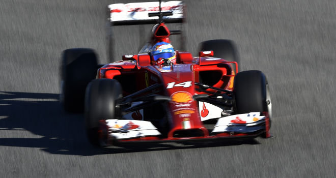 [/fusion_imageframe]
Phew, I can do one of these segments now without making a penis joke! Instead, I have to talk about how it looks like an anteater’s snout. From the angle above, it doesn’t look so bad, but the dip on the front nose looks like The Big Show has sat on the front by accident. A shame, because the rest of the car looks good, and I love the added black to the livery. And it’s better than a lot of the other “options”, other teams have gone with.
#4 – Force India
[fusion_imageframe lightbox=”no” style=”bottomshadow” bordercolor=”” bordersize=”0px” stylecolor=”” align=”none” animation_type=”fade” animation_direction=”right” animation_speed=”1″]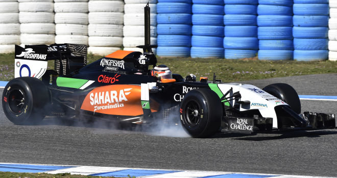 [/fusion_imageframe]
Force India takes the Number 4 slot for having the balls to change their livery big time, and I think it’s worked out brilliantly. I honestly think it’s the best in the sport now. This would have been Top 2 if it wasn’t for one little sneaky trick…They lied about the front wing. Instead of the ones in the picture, they brought out well…that, in Jerez. I’m sorry, I don’t need a Formula 1 car to look like a scene in an Interracial porno!
#3 – McLaren
[fusion_imageframe lightbox=”no” style=”bottomshadow” bordercolor=”” bordersize=”0px” stylecolor=”” align=”none” animation_type=”fade” animation_direction=”right” animation_speed=”1″]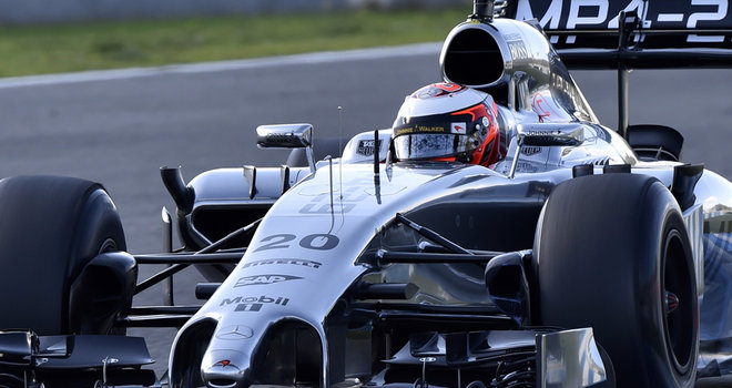 [/fusion_imageframe]
Again, McLaren were the butt…Or front of many jokers early on for being one of the first to reveal their cars. Now we’ve seen the whole lot, and having seen it in action…There isn’t a bad angle on this car. The end plate doesn’t bother me at all, and the car looks great pretty much everywhere. I’d have gone even higher if it weren’t for the kinda bland, all chrome livery. Needs a little more colour. Hope it comes if they can sign a title sponsor up soon.
#2 – Mercedes
[fusion_imageframe lightbox=”no” style=”bottomshadow” bordercolor=”” bordersize=”0px” stylecolor=”” align=”none” animation_type=”fade” animation_direction=”right” animation_speed=”1″]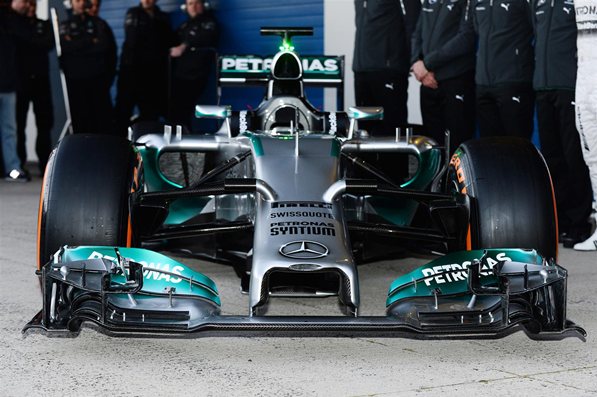 [/fusion_imageframe]
The superior snout wins over Ferrari! This is a nice one, it doesn’t have that same ugly side on impression that the Ferrari has, and the livery of the chrome and the turquoise Petronas livery I just have a soft spot for. Again, not a bad angle on this thing.
#1 – Red Bull
[fusion_imageframe lightbox=”no” style=”bottomshadow” bordercolor=”” bordersize=”0px” stylecolor=”” align=”none” animation_type=”fade” animation_direction=”right” animation_speed=”1″]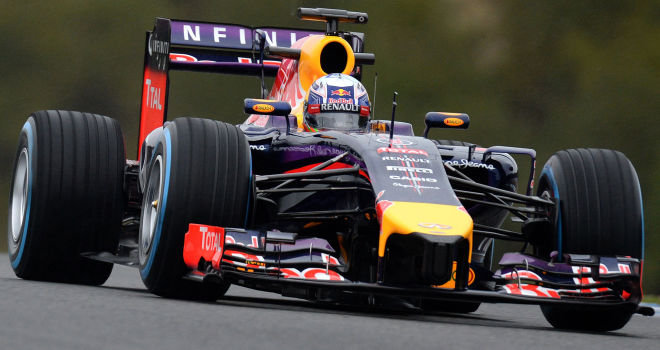 [/fusion_imageframe]
Oh God, I’m going to get the biased comments here again aren’t I? Well, the best thing I can say here, is that the RB10 looks like it wouldn’t be out of place when F1 cars in the modern era actually looked rather good, like the McLaren in 2012 ands cars like the 06′ Ferrari. They were clever enough to paint the end black, so you can barely see the shorter end, and from the side, the car looks great…And I’ve always had a soft spot for the pearlscent paint job. Reminds me of my Need For Speed days.
How would you rank them? Lemme know.
[/fusion_builder_column][/fusion_builder_row][/fusion_builder_container]